6.6 Diagnostics
Assessing model fit is also important for building trust by assessing the plausibility of the generated imputations. Diagnostics for statistical models are procedures to find departures from the assumptions underlying the model. Model evaluation is a huge field in which many special tools are available, e.g., Q-Q plots, residual and influence statistics, formal statistical tests, information criteria and posterior predictive checks. In principle, all these techniques can be applied to evaluate the imputation model. Conventional model evaluation concentrates on the fit between the data and the model. In imputation it is often more informative to focus on distributional discrepancy, the difference between the observed and imputed data. The next section illustrates this with an example.
6.6.1 Model fit versus distributional discrepancy
The MICE algorithm fits the imputation model to the records with observed \(Y_j^\mathrm{obs}\), and applies the fitted model to generate imputations for the records with unobserved \(Y_j^\mathrm{mis}\). The fit of the imputation model to the data can thus be studied from \(Y_j^\mathrm{obs}\).
The worm plot is a diagnostic tool to assess the fit of a nonlinear regression (Van Buuren and Fredriks 2001; Van Buuren 2007b). In technical terms, the worm plot is a detrended Q-Q plot conditional on a covariate. The model fits the data if the worms are close to the horizontal axis.
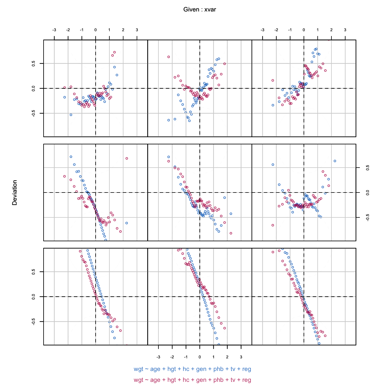
Figure 6.10: Worm plot of the predictive mean matching imputations for body weight. Different panels correspond to different age ranges. While the imputation model does not fit the data in many age groups, the distributions of the observed and imputed data often match up very well.
Figure 6.10 is the worm plot calculated from imputed data after predictive mean matching. The fit between the observed data and the imputation model is bad. The blue points are far from the horizontal axis, especially for the youngest children. The shapes indicate that the model variance is much larger than the data variance. In contrast to this, the red and blue worms are generally close, indicating that the distributions of the imputed and observed body weights are similar. Thus, despite the fact that the model does not fit the data, the distributions of the observed and imputed data are similar. This distributional similarity is more relevant for the final inferences than model fit per se.
6.6.2 Diagnostic graphs
One of the best tools to assess the plausibility of imputations is to study the discrepancy between the observed and imputed data. The idea is that good imputations have a distribution similar to the observed data. In other words, the imputations could have been real values had they been observed. Except under MCAR, the distributions do not need to be identical, since strong MAR mechanisms may induce systematic differences between the two distributions. However, any dramatic differences between the imputed and observed data should certainly alert us to the possibility that something is wrong.
This book contains many colored figures that emphasize the relevant contrasts. Graphs allow for a quick identification of discrepancies of various types:
the points have different means (Figure 2.2);
the points have different spreads (Figures 1.2, 1.3 and 1.5);
the points have different scales (Figure 4.4);
the points have different relations (Figure 6.2);
the points do not overlap and they defy common sense (Figure 6.6).
Differences between the densities of the observed and imputed data may suggest a problem that needs to be further checked. The mice package contains several graphic functions that can be used to gain insight into the correspondence of the observed and imputed data: bwplot(), stripplot(), densityplot() and xyplot().
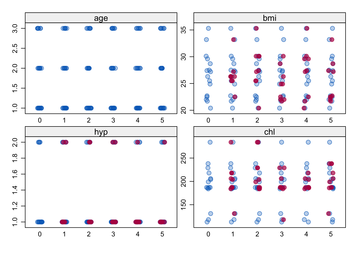
Figure 6.11: A stripplot of the multiply imputed nhanes data with \(m=5\).
The stripplot() function produces the individual points for numerical variables per imputation as in Figure 6.11 by
imp <- mice(nhanes, seed = 29981)
stripplot(imp, pch = c(21, 20), cex = c(1, 1.5))
The stripplot is useful to study the distributions in datasets with a low number of data points. For large datasets it is more appropriate to use the function bwplot() that produces side-by-side box-and-whisker plots for the observed and synthetic data.
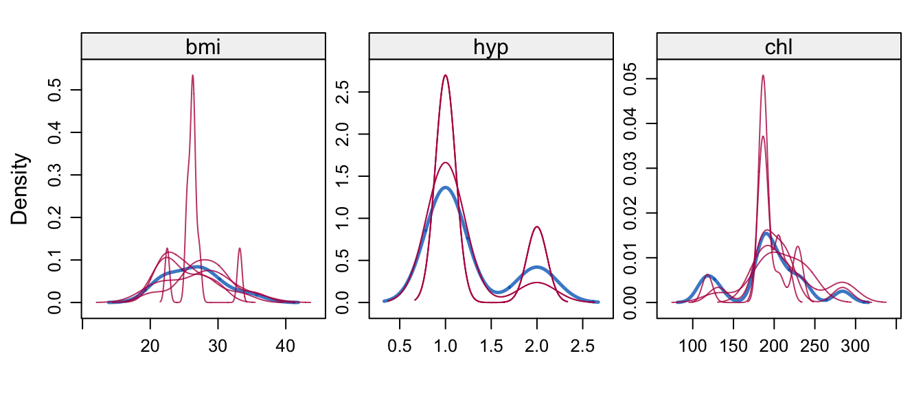
Figure 6.12: Kernel density estimates for the marginal distributions of the observed data (blue) and the \(m=5\) densities per variable calculated from the imputed data (thin red lines).
The densityplot() function produces Figure 6.12 by
densityplot(imp, layout = c(3, 1))which shows kernel density estimates of the imputed and observed data. In this case, the distributions match up well.
Interpretation is more difficult if there are discrepancies. Such discrepancies may be caused by a bad imputation model, by a missing data mechanism that is not MCAR or by a combination of both. Bondarenko and Raghunathan (2016) proposed a more refined diagnostic tool that aims to compare the distributions of observed and imputed data conditional on the missingness probability. The idea is that under MAR the conditional distributions should be similar if the assumed model for creating multiple imputations has a good fit. An example is created as:
fit <- with(imp, glm(ici(imp) ~ age + bmi + hyp + chl,
                     family = binomial))
ps <- rep(rowMeans(sapply(fit$analyses, fitted.values)),
          imp$m + 1)
xyplot(imp, bmi ~ ps | as.factor(.imp),
       xlab = "Probability that record is incomplete",
       ylab = "BMI", pch = c(1, 19), col = mdc(1:2))
These statements first model the probability of each record being incomplete as a function of all variables in each imputed dataset. The probabilities (propensities) are then averaged over the imputed datasets to obtain stability. Figure 6.13 plots BMI against the propensity score in each dataset. Observe that the imputed data points are somewhat shifted to the right. In this case, the distributions of the blue and red points are quite similar, as expected under MAR.
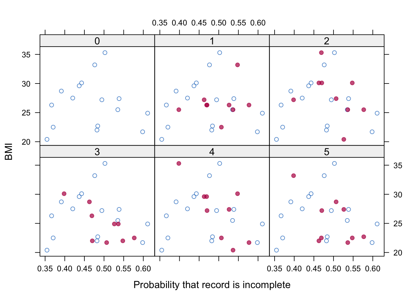
Figure 6.13: BMI against missingness probability for observed and imputed values.
Realize that the comparison is only as good as the propensity score is. If important predictors are omitted from the response model, then we may not be able to see the potential misfit. In addition, it could be useful to investigate the residuals of the regression of BMI on the propensity score. See Van Buuren and Groothuis-Oudshoorn (2011) on a technique for how to calculate and plot the relevant quantities.
Compared to conventional diagnostic methods, imputation comes with the advantage that we can directly compare the observed and imputed values. The marginal distributions of the observed and imputed data may differ because the missing data are MAR or MNAR. The diagnostics tell us in what way they differ, and hopefully also suggest whether these differences are expected and sensible in light of what we know about the data. Under MAR, any distributions that are conditional on the missing data process should be the same. If our diagnostics suggest otherwise (e.g., the blue and red points are very different), there might be something wrong with the imputations that we created. Alternatively, it could be the case that the observed differences are justified, and that the missing data process is MNAR. The art of imputation is to distinguish between these two explanations.